When presseing play on the video please click the full screen button to see it in its true video format.
Tuesday 20 April 2010

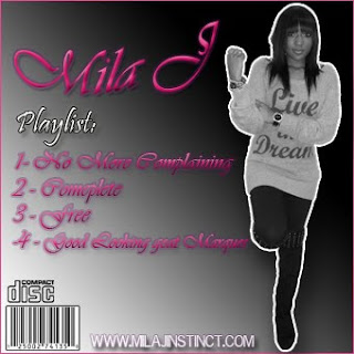
CD Cover

- -Stylish and modernised font with pink colour to connote a glamarous look to the cover which is conventional of the R&B genre.
- Instinct Studio's label is shown clearly with a countour style to make it stand out more in the corner.
- Website advertised for extra publicity.
- Smudge effects used with photoshop, lighting effects and color balance adjustments.
Magazine Advert For Artist

- Black and white aesthetic to give a 'gloomy' atmosphere as that is what the song may connote thus linking the two together.
- Instinct studios made up, added in for the convention of music magazine adverts and cd covers to represent the label with the artist.
- Mila J and No more complaining in stylish but sophisticated font in a pink colour to represent a glamorous look.
- Release date in big white text contrasting with the backround to make it stand out more to the reader making it more rememberable.
- Stylish and yet modernised clothing on performer to link in with conventions of R&B music.
Backcover of music cd
- Conventional as in bar codes, artist website, image and titleblock
- Logos which are recognized and are seen in all covers.
- Stylish and modern font which is in a feminist colour and style
- Artist stands out because of stroke effect.
Sunday 18 April 2010
Evaluation - Question 1,2,4
To see the work in a more clear format please click the button View On Slideshare and then Full Screen Advanced Production – Evaluation A2 Media Coursework
View more presentations from MrAdilCake.
Evaluation - Question 3
What have you learned from your audience feedback?
- Presenting our first rough draft of our music video to peers, teachers and others gave us in depth feedback on what we should do to improve our video. The most clear point stated was that our video used to much greenscreen footage, therefore our group then decided to film more footage, renew the greenscreen with more type of shots for example mid shots and close-ups. However during this rough cut our video does show a lot of similarity with other R&B music for example Beyonce’s “Single Ladies”, in addition we also wanted to show our performer to be more independent as it links in with the lyrics of the song.
- Another point which came across is that there was not enough footage of the main performer with her boyfriend to inform the audience more that they were in love and together as it wasn’t clear enough. As a result we decided to do more filming of the two together representing them to be happy for example showing them laughing together.
- Feedback also helped us to understand that our music video wasn’t as interesting compared to others as there was just not enough cuts. To render this problem we decided to add a variety of shots and effects between long, medium and close ups of the main performer (Bianca) in greenscreen and flashbacks.For example quick cuts, cross disolves, slow motion effects were used to add to the entertainment value of the video.
- Furthermore the feedback given towards the CD cover and magazine advert were mostly positive as it was clear that both linked together and shared codes and conventions of the R&B genre and really showed off the Photoshop ability of the group as lighting effects, smudging, colour balance, gradients, sharpening and cropping were used proficiently.
- Recorded Feedback - Click Link Below
- R09_0017.WAV
Subscribe to:
Posts (Atom)